Friday, 11 June 2010

"It's like, 'how much more grey could this be?' and the answer is 'None. None more grey.'"

Here a little bit of fun MFX owners can do at home.

Remember this pic of the Season 4 prop in the art department workshop?


Look towards the left and you will see one of these:


Yes, a commonly available twin tip Sharpie with a light grey body! Look at the body of the sonic. Similar grey, right? Now see if any of you can take a picture of the MFX and the Sharpie and get them looking grey as in the above shot. You can't. If anything, having the two together should ram home the fact that they are TWO DIFFERENT COLORS!!!!!! One is undoubtedly in the grey family of colors and the other is in the yellow family of colors. You can see that yellows are not washed out: look at the yellow of the paint brush handle and the yellow of the masking tape.

Your move Gorton.

The answer

There is a way of confirming exactly what color the sonic screwdriver is.

We know that Matt Smith used the Season 4 sonic in Eleventh Hour.

We also know that they created a burnt out version which was painted in the exact same paint to match the hero prop. (Don't say they didn't, as it was filmed in HD and to not do would be frankly just stupid).

The burnt out sonic is currently on display at the Cardiff Doctor Who exhibition.

Anyone want to go and find out one way or other?

Did someone order a cunt? Coz one's just turned up.....

Like a drunk who doesn't know when he's been beaten Neill Gorton drags himself up off the ground for yet another flagging. This is actually getting quite painful, more so for Neill, since his reputation has started to plummet within the industry in which he works. Can't he just drop it? Can't he accept he's wrong and just admit it? I don't mind doing it when the facts are there for all to see.

So, without more ado, let's put this glutton for punishment out of his misery:

On the RPF Neill wrote: (My replies in RED)

"CT has also posted a photoshop adjusted copy of my picture of the original sonic on his blog claiming it's a more true depiction of the colour balance on the sonic. In his haste to try and prove himself right in the face of actual facts and proof he has actually helped proved my point for me.

Actually, I posted three pictures with various levels of adjustment.

Here is the 'original' with the anomalous RED value on the histogram circled:


This first pic with the increased red adjusted:


This second pic is the above pic adjusted for brightness only:


And then there is a final pic where I have fucked around with the red intensity and then normalised the other color values to match a white highlight from the far left of the pic:


Any muppet with even a rudimentary understanding of color can see the histograms and see that Neill's original pic has either been taken under in an artificially lit office with daylight coming in from windows on the left of the pic, hence why I used a highlight from the left to get a true white value to balance the color. Neill's original pic clearly shows an over abundance of red and also a heaviness of the Green value towards magenta and the Blue value towards yellow. This proves without question the original source pic is overly 'warm' either naturally or through Gorton's adjustment of the picture saturation. Natural daylight is probably coming in from the left hand side and there is overhead artificial lighting, possibly fluorescent. When natural daylight and and artificial light mix, colors become skewed if the camera CCD has not become white balanced prior to the shot or a ND filter has been used to normalise color levels. You can try this yourself: Place an object on your window sill, turn off all the auto features including auto white balance, on your camera and take three pics: 1. In natural daylight only, 2: With curtains drawn, artificial lighting and flash and 3: With curtains open, artificial lighting and flash. The results will surprise you.It seems that Gorton is dispalying a woeful ignorance of basic colorimetry by posting this pic as 'proof' as it is nothing of the sort.

 My last pic is was an exercise in showing what the sonic would look like in true color, under daylight to the naked eye and was not meant to be anything but that and this manipulation was freely admitted - If anything, the histograms show that there is still a spike in the yellow and magenta ends of the green and blue values. It also does not divert attention from the first and second pics which show minimal color manipulation and merely a straight reduction in red saturation. Nice try Gorton, but you are going to need to do a lot better than that to fudge the issue again!

Take a look at the original image of mine on flickr and look at the slider button where the paint has worn away. It is clearly brass as it was made of brass which is without dispute. Now look at CT's adjusted image to get the body colour to the 'grey' he suggest it is. See how the brass now looks like steel. It's totally lost its distinctive colour through having all the yellow removed artificially. Now, Brass is very distinctive and have never seen it photograph grey in any lighting condition. Even in my comparison shots of the same prop, with and without flash, the brass looks 'brass' in both.
Very true, but see my reply above. This does not detract from the other pics. This pic was supposed to be a more truer example of what the naked eye would see under white light. One can only do certain things within the confines of Photoshop before what you are doing becomes deceitful. I was very honest with what I did and the histograms show that. Can't argue with graphs and figures can we?


Also the hazy colour of the yellow wires showing through on the neck has also disapeared. In addition the body is now the same colour as the carpet tiles in the background. If this grey was the original colour and it was somehow adjusted by tweaking in photoshop or through unusual lighting making the sonic look greenish then the brass should still look like brass when the colour was changed or, if I brought up the yellow value to make the grey look more like Heritage gold green then the carpet tiles would also change colour as well as the aluminium changing colour as has been suggested about other photos. The aluminium would have a gold cast and it doesn't.

The histogram says otherwise. The image is overly saturated on red, yellow and magenta. No bullshit. LOOK AT THE HISTOGRAMS YOU DUMB FUCK!!!!!!!!

This shows that my original image is unadulterated so, if you accept that and you do the eyedropper test in photoshop, and you compare with the colour swatch on the plasti-kote site, you can't come to any conclusion other than heritage gold being the colour of paint used on the original prop. No hocus pocus, smoke and mirrors, wild conspiracies and conjecture just actual images of actual props and a simple test you can do yourself with any image manipulation software.

This is such a flawed, nonsense test and was not the test you originally suggested. How can you do a test like this when the source of the color is an image that is quantitatively proven by the Histograms to be overly saturated?

Orange_Blend actually did the photoshop test and it proves what colours you are dealing with in the images. Have a look at the heritage gold colour swatch on the plasti-kote website and compare it to Orange_blends results.

Orange Blend is a cretin. That test I have performed myself and the results I have posted here:

http://celestialtoystore.blogspot.com/2010/06/riddle-me-this-when-you-reach-rock.html

I have proven that the paint on both the Laser screwdriver and the sonic could be the same paint. They are certainly not different enough in the RGB as even spots of the SAME color such as various points on white paper and two spots on the same paint on the same prop exhibit RGB value variances far in excess of the minor RGB value variances between the paint on the laser and sonic screwdrivers. HOW DO YOU ANSWER THAT ONE YOU DUMB STUBBORN PRICK?

Btw, the Plastikote swatches are of the topcoat alone. If you truly painted all 500 MFX sonics by yourself you will realise the nonsense that this is. The basecoat and underlying material greatly affects the color. In fact, the only way you can get the Heritage Gold color as seen on the Plastikote site is to omit the basecoat and paint the topcoat onto white paper. The other thing, that is even more important, is that the Plasti-Kote swatches are not true colors. Look at the crackle: they are exactly the same! The color has just been color picked and artificially rendered using Photoshop!!!!!!!!!!

 Everyone out there who has access to Plastikote Heritage Gold should try it to prove to themselves I am not talking bullshit.

In case there is any doubt, here's yet another case of the famous Gorton gob overtaking commonsense and basic empirical and quantitative evidence as proven by your's truly:

Here's the RGB read for the color on the prop from Neill's pic:

R: 114
G: 111
B: 70

Here's the RGB reading for the Heritage Gold swatch from the Plasti-Kote site:


R: 205
G:189
B:129


And here's the RGB reading for Colony Cream from the same site:

R: 249
G: 239
B: 203

What  can we gather from this? The color in the Neill's pic is does not match either color from the Plasti-Kote site. They are not even close, say within 30 points out? (Like the differential between the paint on the laser and sonic screwdrivers, for example?). No they are not even in the same ballpark as they are DIFFERENT colors. Since we know it is Plasti-Kote, we can safely say that the colors on the Plasti-Kote site bear no resemblance to the real world appearance of these colors which renders both that Orange Blend cunt's argument and Gorton's argument utterly redundant. You could argue that the RGB values are closer to Heritage Gold than Colony Cream but that still does not make it Heritage Gold. It is like saying a cat is a dog rather than a lizard because they share more in common. That may be the case but they are not the same are they? Anyway, this is not even an equal like for like RGB comparison as Neill's pic needs to be corrected for the red saturation first.

Even if you move the goalposts, I still score, see? That's because I'm not a beardy twat who makes things up as he goes along.

If anyone genuinely can't see the colours then also do the photoshop test and see for yourself. Also look at the original image and CT's photoshop adjusted image and see how, when adjusted in photoshop, all the the other aspects change and become wrong. The simple fact is you can't take a grey object and make it look green without throwning the colours on the aluminium, brass and everything around it, including the skin on my hand in the picture which is totally drained of red, well out of whack and CT's own adjusting of the original proves this. "

Gorton, you are grasping onto one image that I admitted to manipulating. What about the rest? What about the RGB values between  the laser and sonic screwdrivers you were harping on about? You are like a man drowning clutching at the first straw that floats your way. I have risen to your challenge, I have done the Photoshop analysis as you requested but you have ignored my results in favor of a throwaway incidental piece of color correction which I freely admitted to doing and the results of which I have shared. Be a man, where's your fucking pride? Either front up or fuck off. Disprove my Photoshop findings. I challenge you. I fucking dare you. You told me to do the test. I did it. Now you ignore it because the results make you look like a cardboard cutout cunt. There's a nasty smell in here and that is usually a signal to flush the toilet.

Neill Gorton, you are a pathetic little loser.


Addendum: Here something MFX owners can do at home.

Remember this pic of the Season 4 prop in the art department workshop?


Look towards the left and you will see one of these:


Yes, a commonly available twin tip Sharpie with a light grey body! Look at the body of the sonic. Similar grey, right? Now see if any of you can take a picture of the MFX and the Sharpie and get them looking grey as in the above shot. You can't. If anything, having the two together should ram home the fact that they are TWO DIFFERENT COLORS!!!!!! One is undoubtedly in the grey family of colors and the other is in the yellow family of colors.

Your move Gorton.


Tally-ho! Let's go foxhunting

This summary is not available. Please click here to view the post.

Two wires and humble pie for breakfast.

It's just gone 8am. I am sitting in my office and have been here for the past 6 hours staring at my computer screen at these fucking pics Gorton posted up yesterday. Something momentous has dawned on me and although I feel a bit gutted because of it, I am also elated.

First up, remember I called Gorton a bit of cunt for getting his sonic wrong? Color and dimension wise I still stand by that 100%. It is undoubtedly the wrong color and the dimensions are still all over the place. However, in coming to that conclusion I also proved myself wrong in an assertion about a key feature of the prop.

Bear with me for a bit whilst I ramble. Remember in one of my previous posts that I said that there was a rod used in the sonic from Intermediate 2 onwards?

Well, having looked at all the images and in particular, one image, I have come to an inescapable conclusion that I have been mistaken and Neill Gorton's assertion that it is misting caused by incorrect boring of the perspex rod is indeed the reality. Look at the corrected picture of the prop that I corrected earlier:


This pic is probably the most accurate in my opinion to the true appearance of the sonic screwdriver prop in regards to color levels. But it was not the color that drew my eye, rather I was drawn to the perspex rod and its familiarity to my own efforts. Here's a closeup:


In my book, that looks like very bad frosting. I should know: I spent forever trying to get that middle channel reasonably transparent and didn't really succeed until I added some machine oil to it. Here's a pic of one of my early attempts:


I had actually installed this on my of my Tennant prototype mockups as it was to hand so it had yellow wires running through it. Compare it to a closeup of the same area on the prop:


Looks pretty convincing doesn't it?

I shall be revising my sonic color blog entry in light of this but the upshot is that, yes, yellow/grey/white wires were used but became obscured due to the increased misting of the bored channel. The reason for this is actually quite prosaic: Intermediate 2 no longer exists. It is simply Intermediate 1 where the oil that was used to aid transparency by filling in the drilling marks ran out, probably into the battery compartment, leaving the frosting behind. The Intermediate 1 & 2 is the same sonic!!!!! The good news for MFX owners is that the same thing will happen to the MFX as this too also has oil to aid translucency. When this eventually flows out, the misting will become apparent. The result, if you can get the sonic repainted Colony Cream, is a 90% accurate sonic as the remaining 10% is an error in dimensions, shape and construction.

This also means I would like to offer an unreserved apology to Neill Gorton on this particular point and for calling him a liar in this regard. I was wrong here. I am a total cunt and I probably need a new pair of contact lenses for not spotting this sooner.

I am not an unreasonable man and I don't have a hidden agenda. This is not a battle of ego's but one of truth. I truly love this prop and my aim is accuracy, truth and information even if it mean putting my ego into the nearest trash bin. That's the way I roll and that's the way I will continue to roll. However, this single point does not still resolve the question as to why the rest of the sonic is still inaccurate and what precisely happened from between Chris Trice measuring the sonic to Russ Brown delivering on the final product. If we can get to the bottom of this, we can hopefully finally put this unfortunate conflict behind us.

Thursday, 10 June 2010

Riddle me this: When you reach rock bottom what do you do?

...You start to dig.

And Neill Gorton has got out his pneumatic drill and has started digging in earnest.

I've just spent the past half hour driving myself back to the office and my workstation when I could have been tucked up at home, in bed with the wife. Either I'm very sad or very dedicated - the Missus thinks I'm the former, but she feels the same way about LV handbags so guess we are a very sad couple. Still, I wanted to run some analysis on Photoshop as per Neill Gorton's subsequent posts here:

"Take the pic of the sonic and laser and drag it in to photoshop. Put the eyedropper over the crackles and see what colour pops up. They're completely different. Sonic shows as shades of green, laser shows as shades of grey. Do it an at least ten spots to account for the variations on the surface. These are two objects in the same image that it has been said are painted with the same paint. They clearly haven't. If you think they're the same then frankly you either need a new monitor or need your eyes checking.

The wires are obscured by the fact the perspex has been bored out incorrectly which has misted the plastic. Again, do the eyedropper and you will get yellow reading through.

This is fact, and I'm showing you facts, but if you prefer the fantasy then go right ahead and believe what you want.

If you can't be bothered to do this check in photoshop (or pretty much any other photo software with a colour eyedropper) then you really shouldn't be posting.

Enjoy"

and here:

"David actually has three of mine, with heritage gold finish, that I gave him while we were filming the Catherine Tate Xmas special back in early November. He loved them and thought they were spot on!
I also have three which David signed for me with a Sharpie on top of the Heritage Gold crackle finish. I like to collect the odd little souvenir. Russell T also has one, and Julie Gardner, I gave them theirs at the screening of the last episode at BBC TV centre in late December. Nick Robatto has one I gave him too as thanks for all his help with reference material. Strangely none of these people ever questioned the colour... Hmmm. can you guess why that is?

Regarding the laser not being in question. The point was if the crackle on the laser is the cream colour plastikote and it's different than the paint on the sonic int he same image then what colour is the sonic if you have all of three colours in the plasti-kote range to choose from; cream, black and heritage gold....?

...I'll help you there. It's NOT Cream, it's clearly NOT black so it must be.......... Heritage gold anyone?

Anyone tried the photoshop test yet?"

Ok Neill, you asked for it.

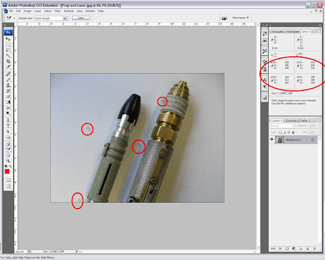
Here's the protocol: I am taking a color from a single random point on the alleged 'Heritage Gold' sonic body within the pic which is then displayed as an RGB value on the right hand side. Both points are circled in red. I then do the same with the ridged end of the Laser screwdriver which is known to be painted in Colony Cream.

The results are simultaneously unsurprising and surprising:


As the above analysis shows from various points taken across the two props - in shadow, in light and in-between, the values don't deviate much in the RGB. From a few points up to about 28ish (I don't know the EXACT amount as I can't be bothered to tot up the exact figure)  - Basically, not very much variation across Red, Green and Blue and certainly not enough to warrant it being a completely different color. Not convinced? Unless you are a total moron this should convince you:


What I have done is taken a reading of the white paper, a color that we are not disputing the color of, to show that even across a single color, shadow, lighting and angle can give differing RGB values. However the point I am trying to make is that even though there can be a thirty point discrepancy in color value, it does not change the color. On the above white analysis, the values differ around 30-40 points and even on the Blue values between point 1 and point 2 above, the Blue value differs by 72 points! But you won't have Gorton arguing that the paper has been painted in different shades of white!

Even the paint on the same prop differs in value across different points. See here on the sonic:


There is an approximate 40 point difference in the RGB values between the two points of the same color on the prop! What's Gorton going to do? Argue that the sonic is now painted two different colors simultaneously?

So what does this analysis show? Well, it shows that the laser screwdriver and sonic are probably painted in the same or similar color. What this ABSOLUTELY proves is that they are not widely different colours as Heritage Gold is from Colony Cream.

So why is there even any disparety between the paint on the Laser screwdriver and the paint on the sonic? Very easy answer: The angle of the ridges on the laser for one. There is no horizontal surface on the ridges so you end up with stark light or shadowy areas. The other reason is I don't think the laser screwdriver is clearcoated!!! I know this for a fact. Clearcoating darkens and greys out Colony Cream. Here's a pic of my unclearcoated prototype from last year:


And here's a pic of a clearcoated production model. The only difference to the paint is the clearcoat:


Quite some difference, eh?

What of the photo Gorton posted of the yellowy sonic? Well, here's the answer:

I took a look at the RGB histogram of this pic. The first thing you will notice is a hump  in the middle which tells us that the pic is generally quite well exposed with the light well balanced. But the second thing you will notice is clipping on the red channel on the far right. Basically, there's a lot of red in the pic, probably through overexposure of the red.  This tells us that the picture is lit by artificial light giving too much redness and warmth to the pic.  There is also a shift in the Blue histogram toward the yellow (left) hand side and on the green this is also heavy on the left suggesting a shift in intensity towards magenta. All this means that the sonic in the pic is too yellow!!!!!!!!
What happens when you adjust that red saturation?. This:


Turn up the brightness a little to match a smilar brightness of the original pic and this happens:


You end up with a grubby, but definitely Colony Cream flavored sonic.

I've since done some tweaking of the levels having examined the histograms and this is what I believe is the final color under daylight. It preserves the original's light levels and overall saturation/hue but adjusts it to account for red brightness so the colours remain truer (see the flesh of the hand and you will see I haven't messed around too much with the levels, merely adjusted red intensity and corrected the contrast and brightness levels without altering hue and saturation to any significant degree):

Anyone with Photoshop is perfectly free to check these findings themselves.

I bet Gorton wishes he'd never issued the challenge, doesn't he?

Game, Set and Match

Galvanised by the 'HeritageGoldGate' saga (thanks Birdie), Neill Gorton has posted further pics of the prop that Chris Trice measured. Here is his response on the RPF and the pics for your pleasure:

"God this is getting soooooooo boring!!!!

original sonic flash and no flash on Flickr - Photo Sharing!

Both shots of the same original prop sonic (check the crackle and wear pattern) as supplied by the art department and photographed in the art department by me (that's my hand and I can prove it) in both flash and daylight showing how the heritage gold goes grey under flash or cold light, blah blah blah.

In addition original prop sonic next to laser screwdriver - screwdriver is painted with cream/grey crackle and sonic with Heritage gold - you can clearly see they're different, blah blah blah.

Sonic in this case was well used and very grubby (because it was used for filming believe it or not!) and not lacquered hence the greenish tinge is quite flattened, blah blah blah.

I won't be posting anymore on the rpf about sonics because it's a complete waste of time. If you want to stand there pointing and believing the king is wearing new clothes then good luck to you. By the way, did you know; I also shot JFK, I flew the planes in to the twin towers, the Roswell spaceship is in my garden shed and I changed the sonic and painted it a different colour just for laughs .

If anyone wants to return their sonic because CT says the colour is wrong then I will simply tell you to take your complaint to BBC worldwide who will check their references and check with the production props people and simply tell you it's actually the right colour and then who will you believe?

Have fun

Neill "
 
The pics can be found here: http://www.flickr.com/photos/mfxreplicas/
 
The two pics in question, here:


So what do we have here? It certainly looks that the pic on the lower right could be Heritage Gold. However, I'm not so sure. It looks like a grubby Colony Cream sonic to me.

The reason for this is obvious: I cannot get Heritage Gold to look grey/white under ANY lighting condition. It retains it's distinctive yellow hue, even under flash. Especially under flash. MFX owners can try this themselves and please feel free to post the results to me and I will post them up here.

If you look at the graph paper in the top pic, it looks a touch yellow but the colour is essentially true - more or less. Still looks grey to me.

So why the yellowishness of the lower right pic? Simple answer: Look at the floor: it's a carpeted office floor and the lighting is almost definitely artificial lighting. Here's a pic of my colony cream painted prototype under artificial light:


Note that Gorton posted the pic of the Laser screwdriver up for comparison. What's he's saying is that the Laser screwdriver ridged end was painted Colony Cream. The prop was painted Heritage Gold. Ok, here's the craic: Look at the following two pics. One of my Colony Cream sonic and one of the Heritage Gold MFX taken with and without flash, side by side:


The colors are distinct and different. The Laser screwdriver in the pic above looks like the same paint only grubbier and has a difference in coat application thickness.

The conclusion is that Colony Cream can look like Heritage Gold under certain circumstances but Heritage Gold can never look look like Colony Cream under any circumstance

Confused? Don't be. The MFX sonic is the wrong colour. Period.

I don't have Photoshop here on my laptop but will look at the RGB histograms in the morning but that should give you a pretty good idea as to the color behaviour in these pics.

Most disturbing from these pics is the lie that Gorton has perpetrated.

Why is the spacer block in the slider channel painted? Gorton stated himself that the reason why his replica lacked this feature is because the prop Chris measured lacked it. Again, BULLSHIT.

You can also see from the pics that the ridges on his replica are wrong as is the lower bevel just above the lower neck: on the prop and on mine it is a distinct bevel. On the MFX it is a curved radius.

Sorry peeps, but it's GAME, SET and MATCH.

Taxi for Mr Gorton please......


Introducing… The Reference Edition

Well, here we are—winter has turned to spring, and the release of the Celestial Toystore Reference Edition Sonic Screwdriver is getting clos...